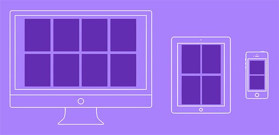
I. Introduction to Flexbox and Layout System
The advent of Flexbox, a CSS layout system, has transformed the way we design and structure web pages. Unlike its predecessors, Flexbox provides a highly flexible and efficient approach to creating complex layouts. In this article, we will explore the fundamental concepts of Flexbox and the advantages it brings over traditional layout systems.
II. Understanding the Flexbox Basics
Flexbox revolves around two key components: the flex container and flex items. The flex container serves as the parent element that establishes the flex context, while the flex items are the child elements placed within the flex container. By defining flex properties, designers can effectively organize content and position elements on the page.
III. Flex Direction and Flex Wrapping
Flexbox allows for flexible directional control through the flex-direction property, which defines the main axis along which flex items are laid out. The flex-wrap property, on the other hand, determines whether flex items should wrap to a new line when the container overflows. Understanding these properties enables designers to create multi-line or single-line flex containers with ease.
IV. Aligning Flex Items
Aligning flex items is a crucial aspect of creating visually appealing and well-structured layouts. Flexbox provides several properties like justify-content, align-items, and align-self to align items on the main axis and cross axis. These properties offer fine-grained control over the positioning of flex items within the flex container.
V. Flexbox Ordering and Reordering
Flexbox introduces the flex order property, which allows designers to rearrange the order of flex items without altering the source code. This feature provides flexibility in changing the visual order of elements for different screen sizes or design requirements. Additionally, using flex order responsibly ensures maintainable and accessible layouts.
VI. Flexbox Sizing: Flex Grow, Flex Shrink, Flex Basis
Flexbox offers the flex-grow, flex-shrink, and flex-basis properties to control the sizing behavior of flex items. Flex-grow allows items to grow proportionally within the available space, while flex-shrink enables them to shrink when there is limited space. The flex-basis property sets the initial size of the flex items.
VII. Combining Flexbox with Other Layout Techniques
Flexbox is a versatile layout system that can be combined with other techniques like CSS Grid Layout to create even more powerful layouts. By understanding when to use Flexbox or CSS Grid Layout, designers can craft sophisticated and adaptive designs suitable for various use cases. Additionally, utilizing progressive enhancement ensures compatibility with older browsers.
VIII. Real-World Examples of Flexbox in Action
To illustrate the capabilities of Flexbox, we showcase practical examples of its implementation in web design. From building responsive navigation bars to creating equal height columns and flexible card layouts, these examples demonstrate the versatility and effectiveness of Flexbox in real-world scenarios.
IX. Advanced Flexbox Techniques
This section delves into advanced Flexbox techniques that go beyond basic layout control. Topics covered include using Flexbox for sticky and fixed positioning, mastering alignment for centering and equal spacing, and nesting Flex containers to achieve hierarchical layouts.
X. Optimizing Flexbox for Performance and Accessibility
While Flexbox is a powerful layout system, it’s essential to use it efficiently to maintain performance. This section explores best practices for optimizing Flexbox usage and ensuring that designs remain accessible by implementing proper semantic HTML structure and addressing common Flexbox issues.
XI. Flexbox in the Future of Web Design
As web technologies evolve, Flexbox is expected to receive updates and enhancements. In this section, we discuss upcoming features and improvements in CSS Flexbox Level 2 and the role of Flexbox in the era of responsive and mobile-first design. Additionally, we explore the potential integration of Flexbox with emerging web technologies.
XII. Conclusion
Flexbox has emerged as a powerful and indispensable layout system for modern web design. Its flexibility, efficiency, and ease of use have made it a preferred choice for designing complex web layouts. By leveraging Flexbox, designers can create visually stunning, user-friendly, and responsive web designs that elevate the user experience and set new standards in web development.


